|
Are world markets becoming progressively more expensive?
Date: 13 May 2019 Category: Financial markets and Economics |
Related Topics |
|
We analyze data and graphics published by the International Monetary Fund (IMF) in their April 2019 World Economic outlook and wonder if they data and graphics point to over priced world markets?
|
|
Tobin's Q for advanced economies
So what is Tobin's Q and why can it be used as a gauge in order to determine of world markets are overpriced or undervalued? Tobin's Q is a ratio of the market value of a firm over the cost of the replacement of the firms assets. A ratio of less than one shows that there is value as the cost of replacing the firms assets is more than what the firm is worth. Essentially the company's assets is worth more than the company's market value. While Tobin's Q has been adapted over the years to compare market value to net assets (assets - liabilities) , Tobin's Q is still a useful indicator of market valuations. The image below shows the Tobin's Q ratio over time for advanced economies.
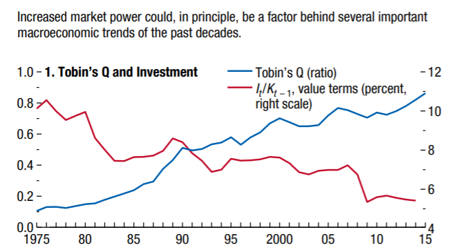
Tobin's Q for advanced economies
The Tobin's Q ratio (the blue line in the graphic above) has been increasing steadily over time. Part of the reason for this is that market valuations are a lot higher due to ever higher expected returns on investment. And this has been fueled over the last couple of decades by greater globalization, greater efficiencies in production, which has by and large been driven by increased use of technology. The image below shows the return on capital as well as long term interest rates for advanced economies.
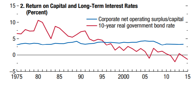
And while the "risk free" rate of return (red line representing long term government bonds) has been steadily declining over time, the corporate net operating surplus/capital ratio has remained fairly steady. Making one wonder why markets would continue to expect ever higher returns when the net operating surplus/capital percentage has not been increasing over time. Is it an indication that there is to much capital/money in financial markets? Or in company coffers?
The two graphics below shows the measure of mark ups over time. The first graphic shows that from the year 2000 to 2015, markups increased by 6% over the 15 year period. A slow but steady increase in markups added to goods and services. Laster we will take a look at whether markups are higher for advanced economies or emegring markets.
The two graphics below shows the measure of mark ups over time. The first graphic shows that from the year 2000 to 2015, markups increased by 6% over the 15 year period. A slow but steady increase in markups added to goods and services. Laster we will take a look at whether markups are higher for advanced economies or emegring markets.
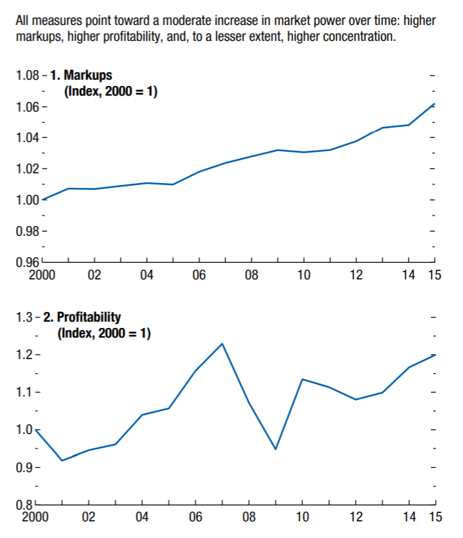
The second graphic above shows the profitability evolution of firms for the 27 sampled advanced economies. Over the 15 year period from 2000 to 2015 the profitability has increased by about 20%. Perhaps explaining the continued increases in market valuations over time. Stock prices continue to rise as the profitability of firms rise.
So how does the markup of advanced economies compare to that of emerging markets? The image below shows the markup of advanced economies compared to that of emerging markets.
So how does the markup of advanced economies compare to that of emerging markets? The image below shows the markup of advanced economies compared to that of emerging markets.
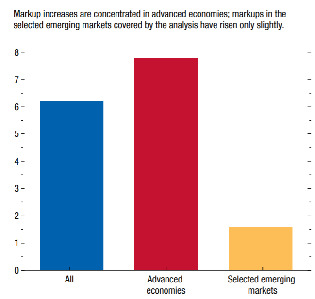
The image above shows that markup increases are concentrated from advanced economies, with emerging markets barely showing any increases in markups. Are poorer economies (such as emerging markets) struggling to pass on higher margins and markups onto their consumers? It certainly looks like it is the case based on the graphic above.
The following is quoted from the IMF world economic outlook ,"There is substantial variation, as well, in the rise in markups across advanced economies, with significantly larger increases in the United States (twice as large as in the average advanced economy). Although markup increases have also been rather broad based across industries, trends differ: nearly two-thirds of the country-industry pairs in the sample show markup increases, with the largest among nonmanufacturing industries and in industries that use digital technologies most intensively.7 The average markup across manufacturing industries has been mostly flat.
To sum up, there has been a moderate rise in corporate market power since 2000 across advanced economies, but not across the emerging markets covered by the analysis. Although increases have varied in magnitude across advanced economies and industries, in most cases, the main driving force was the ability of a small fraction of high-markup firms to strengthen their market power—and also gain market share in some countries, such as the United States. These firms were typically more dynamic than others, tentatively suggesting that changes in the structure of product markets—such as the winner-takes-most dynamics benefiting the most productive and innovative firms, rooted in part in specific intangible assets—are behind at least some of the overall rise in market power. "