|
Related Topics |
|
This page will take a look at South African consumer's spending patterns (based on the 2010/2011 Income and Expenditure Survey conducted by Statistics South Africa). Changes in the consumption behaviour of a household are often dependent on the changes in the level, or perceived level of wealth of the individual. This is known as the wealth effect. There is usually a positive relationship between the two: as wealth rises, so too does consumption, as well as savings.
However, there are usually differences in the spending distribution of higher and lower income groups. Lower income households generally devote a large proportion of their income to items like food, while wealthier households spend more on items such as recreation. Although the wealthy spend more in total Rand value on most categories, spending as a share of total expenditure is smaller, due to higher income levels. In 2010/2011 (latest available official data), the lowest income decile (poorest 10%) in South Africa used about 31% of their income to buy food, as opposed to the highest decile (richest 10%), where expenditure on food accounted for only 5.6% of total spending. The wealthy also spent considerably less in relative terms on commodities like alcohol and clothing and footwear. The wealthy devoted a larger share of their income to spending on housing, transport, recreation, and miscellaneous commodities. Somewhat surprisingly, the share of income spent on furniture, health and communications are quite similar across all income deciles. Another interesting point is that poorer individuals appear to spend more of their income on eating out (3.2% of the total income of the lowest decile), and 2.4% for the highest income decile. The distribution of income spending also has interesting implications for the differing levels of CPI for different commodities. For instance, the recent dramatic rise in food prices would have a more damaging impact on poorer households, as the proportion of their income spent on food is so much larger. Our detailed analysis will cover the following major groupings:
We will plot each of the groups mentioned above and break it down into 10 expenditure groups (deciles), from the poorest 10% to the richest 10%. We start off by looking at Food and Non-Alcoholic Beverages. |
|
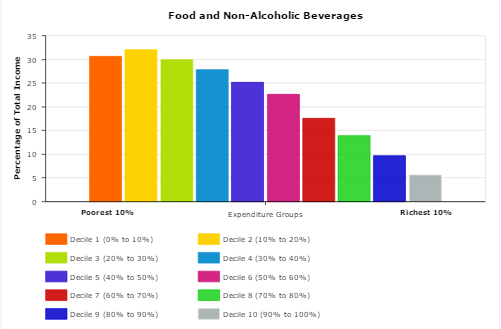
Food and Non-Alcoholic Beverages
|
|
The graphic to the left shows the percentage of total income spent by each expenditure group on Food and Non-Alcoholic Beverages.
As can be seen from the bar chart, the wealthier the household the lower the proportion of total income spent on Food and Non-Alcoholic Beverages. The poorest 10% spent 30.7% of their income on Food and Non-Alcoholic Beverages, while the richest 10% only spent 5.6% on Food and Non-Alcoholic Beverages. |
Alcoholic Beverages, Tobacco and Narcotics
|
|
In a similar trend to Food and Non-Alcoholic Beverages, they wealthier the household the lower the proportion of total income spent on Alcoholic Beverages, Tobacco and Narcotics.
The poorest 10% spent 2.5% of their income on Food and Alcoholic Beverages, Tobacco and Narcotics, while the richest 10% only spent 0.6% of their income on Alcoholic Beverages, Tobacco and Narcotics. |
Clothing and Footwear
|
|
The graphic to the left shows the percentage of total income spent by each expenditure group on Clothing and Footwear.
As was the case with first two groupings above, the trend again shows that the wealthier households spends less as proportion of overall spending on Clothing and Footwear than the poorer household groupings. The highest proportion of total income spent on Clothing and Footwear was reported by decile 3 (spending 8.3% of total income on Clothing and Footwear) while the richest 10% only spends 2.6% of their total income on Clothing and Footwear |
Housing, Water, Electricity, Gas and Other Fuels
|
|
The graphic to the left shows the percentage of total income spent by each expenditure group on Housing, Water, Electricity, Gas and Other Fuels.
In a complete reversal to the groupings seen above, the poorer groupings spends far less of their total income on Housing, Electricity, Water, Gas and Other fuels compared to the wealthier groupings. From the graphic it's clear as wealth increases, spending on this category increases with the richest 10% spending 36.3% on this group while the poorest 10% only spends 22.7% on Housing. |
Furnishings, Househould Equipment and Routine Maintenance of the House
|
|
The graphic to the left shows the percentage of total income spent by each expenditure group on Furnishings, Household Equipment and Routine Maintenance of the House.
As mentioned in our introduction, the spending on this grouping as proportion of total spending is very similar across all expenditure groups (notice small scaling of graph in the left), with spending varying between 4.6% and 6.2% of total income |
Health
|
|
The graphic to the left shows the percentage of total income spent by each expenditure group on Health. Spending on Health is pretty evenly spread across income groupings (note medical aid costs are not counted in this category but under Miscellaneous goods and services).
This category covers out of pocket expenses for general healthcare services such as GP's, Dentists etc. |
Transport
|
|
The graphic to the left shows the percentage of total income spent by each expenditure group on Transport. No real surprises here.
As wealth increases the spending on Transport increases, as households buy private vehicles instead of using public transport such as trains, buses and taxi's. The richest 10% spending 19.6% on Transport while the poorest 10% spends 11.8% of their income on Transport |
Communication
|
|
The graphic to the left shows the percentage of total income spent by each expenditure group on Communication.
The amount as proportion of total income spent on Communication is pretty evenly spread across the various income groupings, with expenditure ranging from 2.6% to 3.2% of total income |
Recreation and Culture
|
|
The graphic to the left shows the percentage of total income spent by each expenditure group on Recreation and Culture. As wealth increases the proportion of total income spent on this category increases.
This category includes a wide variety of items such as camera's, video cameras, boats, kayaks and canoes, musical instruments, books and stationary, sporting events, theater events, games of change (Lotto) etc. The poorest 10% spend 1.8% of total income on Recreation and Culture while the richest 10% spent 3.5% of their total income on Recreation and Culture. |
Education
|
|
The graphic to the left shows the percentage of total income spent by each expenditure group on Education.
Again the wealthier the household the more money spent on Education. Money spent on private schools and tertiary education (Universities) plays a big part here, as the wealthy can afford to send their children to private schools and pay for their University education. The poorest 10% spend 1.5% of total income on Education while the richest 10% spent 3.3% of their total income on Education. |
Restaurants and Hotels
|
|
The graphic to the left shows the percentage of total income spent by each expenditure group on Restaurants and Hotels.
What is really interesting to note about this category is the proportion of total income spent on Restaurants and Hotels by the poorest 10%. One would think that they would not spend a lot of money on this as it's not an "essential" good or service. This category includes, Restaurants, Hotels, Canteens and hostels for young workers. Perhaps that is the reason why the poorest 10% spends a large portion of money on this category. It might be due to payments made to hostels. |
Miscellaneous Goods and Services
|
|
The graphic to the left shows the percentage of total income spent by each expenditure group on Miscellaneous Goods and Services.
This category includes insurance (medical, life, building, transport) and other financial services, personal care such as hairdressers etc. As one would expect the wealthier groups spend more on this category than the poor (as they have cars, and expensive houses etc they insure etc). The poorest 10% spending only 8.9% on this category compared to the wealthiest 10% that spends 16.9% of their income on this category. |
From the bar charts above it is clear the the poorer households spends a bigger proportion of their total income on more "essential" goods and services such as Food and Non-Alcoholic Beverages, Clothing and Footwear while the richer households spends far larger proportions of their income on Housing, Transport and Recreation and Miscellaneous (items that can be seen as more "luxury" goods and services than essential goods and services). With the CPI undergoing a reweighting soon, it would be interesting to plot these graphs again, using more recent data to see how consumer spending patterns has changed since 2010 .