|
Related Topics |
|
In today's blog we look at the Price/Earnings or PE ratio of the Johannesburg Stock Exchange (JSE) All Share Index. And we find that eh overall market PE ratio has been climbing steadily over the years. But there are a few interesting observations made by asset management company, PSG regarding the PE ratios of various companies listed on the JSE.
|
PE ratio of the JSE ALSI
The interactive graphic shows the PE ratio per month from the beginning of 2007 for the JSE All Share (ALSI). The PE ratio per month is represented by the dark grey line, the 12 month rolling average of the PE ratio is represented by the light blue line. The 12 month rolling average assists in removing seasonal variations from the monthly PE ratio. It also service to show the short term trend of the JSE ALSI PE ratio. And then the 5year rolling average which is represented by the red line represents the long term trend of the JSE ALSI PE ratio.
As the graphic shows there was a significant decline in the JSE ALSI PE ratio in middle 2008 to middle 2009, when the financial crisis was in full swing which hit stock markets and companies' operating environments very hard. Howeever PE ratios quickly started going up again as share prices started rising again as the the markets started pricing in better profits in future. While the PE ratio and the short term trend (the light blue line) is fairly volatile, it has shown a significant upward trend since late 2012 to the beginning of 2017. However the PE ratio of the JSE ALSI as well as the short term trend in the PE ratio has declined steadily in 2017. Another reason for the increasing PE ratios on the JSE is the weakening exchange rate. As the exchange rate weakens, future earnings of JSE listed rand hedges such as Naspers, Richemont, British American Tobacco etc is expected to increase strongly, and by virtue of that their share prices gains have reflected strong increases before the actual earnings have come through leading to elevated PE levels.
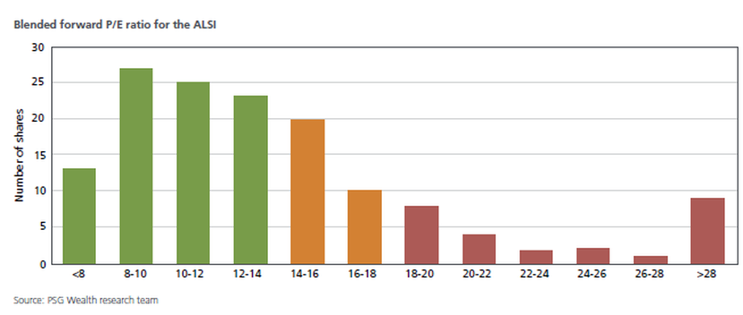
The image below was obtained from PSG's Spring 2017, Investment Research and Strategy Report
According to the image below there is a large cluster of companies listed on the JSE with PE ratios below or equal to 14. Which in most markets and peoples eyes would be deemed relatively cheap, and then there is a small chunk of companies with PE ratios well above 28, which most market commentators would deem as extremely expensive at such high PE ratios.
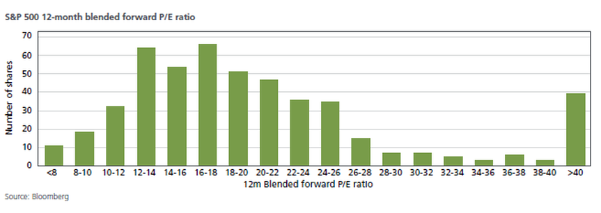
The problem with those companies with the exceptionally high PE ratio's is the fact that some of them are some of the biggest shares listed on the JSE,and therefore they carry a significant weight in the overall market, and it pushes the overall PE ratio of the ALSI up. As at end of October 2017, the JSE ALSI had a overall PE ratio of 20.5, yet the majority of shares on the JSE trade at PE ratios well below the overall market average. So how does the distribution of shares according to PE ratios compare to other stock markets around the world, like the S&P for example? The image below was obtained from the aforementioned PSG report, but they quote the source of the information in the graphic below as Bloomberg.
The distribution of the companies by PE ratio on the S&P is very similar to that of the JSE ALSI. A large cluster between PE of 8-16, it then tails off and then at the far end of the spectrum there is a large chunk of firms with exceptionally high PE ratios. So this is not a South Africa only problem. But it has to be said the overall PE ratio of the JSE ALSI of 20.5 is far higher than the PE ratio of 17.7 on the S&P. But when we remove NPN from the PE calculation the current PE of the JSE is sitting at 17.7 (the same level the S&P) is at.
For more on the markets see www.jse.co.za or for more information from PSG see www.psg.co.za
For more on the markets see www.jse.co.za or for more information from PSG see www.psg.co.za
Let us know what you thought of this article: |


