|
Related Topics |
|
In this article we take a look at a report published by Statistics South Africa in which poverty is mapped on a map of South Africa making it easy to highlight the areas where poverty is most prevalent in South Africa.
We covered poverty a few days ago in which we highlighted how many people see themselves as poor, see that article here, but in this article poverty is defined by Food-poverty line and shown on a map of South Africa. |
So percentage of South Africans defined as poor
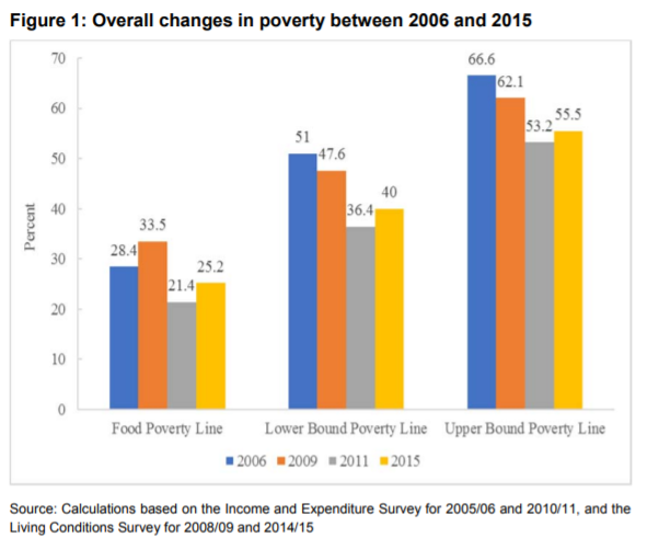
So what percentage of South Africans are seen as poor when food poverty lines as calculated by Statistics South Africa are used as the yardstick for determining whether someone or a household is poor? Or when using the lower and upper bound poverty lines as calculated by Statistics South Africa, what percentage of South Africans are seen as poor when one of these metrics are used to determine when someone is poor. The bar chart below shows the percentage of South Africans seen as poor using food poverty and lower and upper bound poverty lines and how this has progressed/regressed over time.
The graphic above shows just how tough economic times have been in recent years, with percentage of South Africans being seen as poor increasing from 2011 to 2015. While strong progress in reducing poverty levels was made from 2006 up to 2011, this trend has been reversed and poverty levels are on the increase again. Based on food poverty line, 25.2% of South Africans were seen as poor in 2015, up from 21.4% of South Africans seen as poor in 2011. Essentially government went nowhere, well they went backwards in addressing poverty in South Africa from 2011 to 2015.
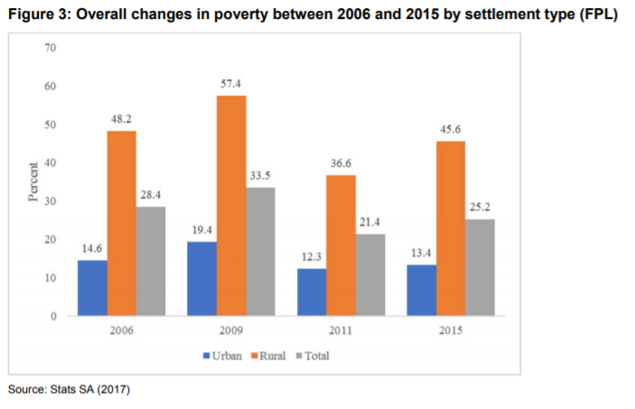
The graphic below shows the poverty levels (using food poverty lines) and grouping it by settlement type. It is clear poverty levels in rural areas are far greater than in urban areas. This is largely due to the fact that most job opportunities are found in urban areas.
The graphic below shows the poverty levels (using food poverty lines) and grouping it by settlement type. It is clear poverty levels in rural areas are far greater than in urban areas. This is largely due to the fact that most job opportunities are found in urban areas.
According to the graphic above 13.4% of people staying in urban areas (close to or within cities and towns) are seen as poor using the food poverty line as the base, while 45.6% of people living in rural areas being seen as poor. While poverty levels in 2015 has increased from 2011, it is still lower than levels seen in 2006. Strong progress in poverty reduction in rural areas have been made from 2009 to 2015, with percentage of poor people in rural areas dropping from 57.4% in 2009 to 45.6% in 2015.
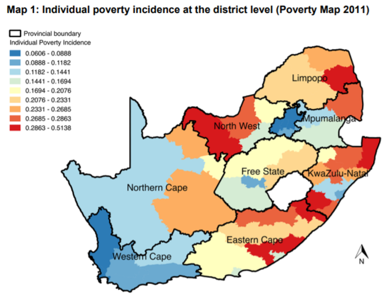
So tables and charts are great, but its a lot nicer to see poverty levels on a map of South Africa so that we can see where exactly is poverty the most prevalent. The map below shows the number of poverty incidences on a district level (based on 2010/2011 Income and Expenditure Survey data and 2011 Census data).
So tables and charts are great, but its a lot nicer to see poverty levels on a map of South Africa so that we can see where exactly is poverty the most prevalent. The map below shows the number of poverty incidences on a district level (based on 2010/2011 Income and Expenditure Survey data and 2011 Census data).
In the map above the darker the blue the fewer the incidences of poverty within a specific district, while the darker the red the more incidences of poverty per district. The darkest blue shows poverty levels of between 6% and 8.8% for a particular district within South Africa, while the darkest red shows poverty levels between 28.6% and 51.4%.
It is clear that the Western Cape and Gauteng has the lowest incidences of poverty at district level when looking at the map above, as these two provinces are totally covered by blue and dark blue which shows the lowest levels of poverty. Provinces with areas of significant poverty include the Eastern Cape, North West, Limpopo and KwaZulu-Natal.
It is clear that the Western Cape and Gauteng has the lowest incidences of poverty at district level when looking at the map above, as these two provinces are totally covered by blue and dark blue which shows the lowest levels of poverty. Provinces with areas of significant poverty include the Eastern Cape, North West, Limpopo and KwaZulu-Natal.
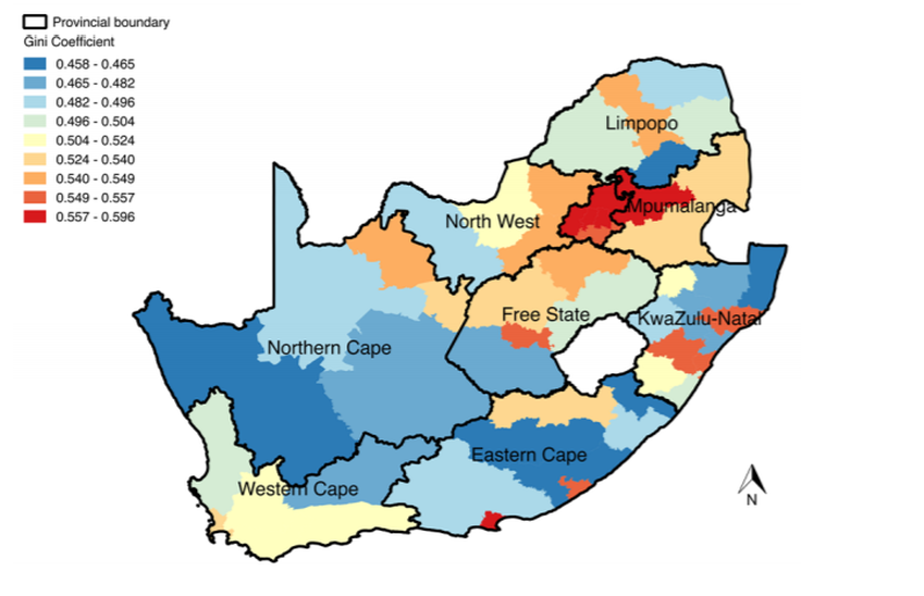
While the first map gives a good indication of where poverty is the most severe, there are a few ways to draw up these maps. The following map, looks at the Gini coefficient to map poverty, whereas the first one used the food poverty line to highlight the percentage of people within districts that are poor.
Readers will notice the well behaved Gauteng and Western Cape in the first map looks totally different in the second map as shown above. Gauteng in particular being blood red. The reason for this is the fact that the Gini coefficient measures inequality. Essentially the map above says income is extremely skewed in Gauteng with there being massive variation in the income of individuals, while low levels of poverty was reported in Gauteng and Western Cape in map 1, the map above shows that the income earned by individuals in these provinces differ significantly. While the Eastern Cape and KwaZulu-Natal were pretty red in map 1 earlier in the article which indicates high levels of poverty, when using the Gini coefficient these two provinces are rather blue. What this is saying that while there are high incidences of poverty as per the first map, the map above shows income earned between individuals are very similar. So most people in these provinces are equally poor. While for Gauteng in example, while there are fewe incidences of poverty in Gauteng, the income disparity between individuals are significant.
